Student Testimonial: Benjamin Guilfoyle
Project: Clericus
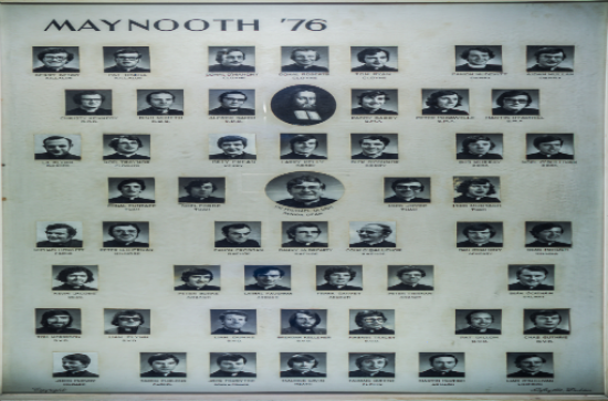
Clericus is a project aimed at documenting the various people that passed through St Patricks college over its 200+ year history. My role was to create graphical representations of those ordained. I used 4 techniques to help illustrate this; heatmaps, scatter plots, bar charts, and network graphs. Each of them has their advantages and disadvantages, but together they can form a cohesive narrative and insight into the history of St Patricks college. My main source throughout the 6 weeks was the 1895-1995 Hammel List. This document outlines the name, degree, dates entered/ordained, and the diocese associated with each student. The end-goal of this project is to marry it with the Clericus web-app and bring the archive to life with some of these graphs and plots.
Clericus was such a fascinating project for me to work on as it allowed me to branch out from my normal field of study, physics. Clericus provided me with some unique situations not normally seen when looking at physical data. In physics you often relate your data to formula, and observations, where as here I am relating my data to cultural events throughout history. This project provided me with an insight into the world of data visualisation outside of a laboratory setting, while also allowing me to improve on skills that crossover between the disiplines of science and humanities.
Below are some of the plots gathered over the course of the project.
Here we see the number of entrants (red), and the number of ordinations(green) over a period of 100 years.
Fig. 1 Graph of Ordinations over a Century
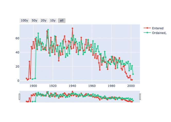
(Source: Hamell)
Here is the number of ordained who went to the diocese of Tuam, Dublin, and Kerry over the same period.
Fig. 2 Graph of Ordained Clergy by Diocese
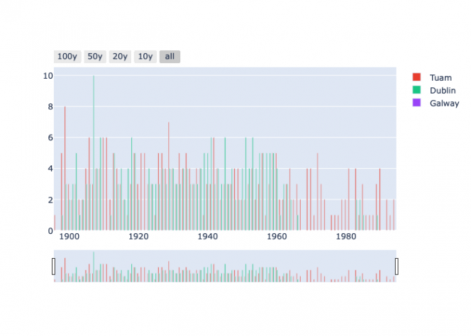
(Source: Hamell)
Next is a heatmap showing the diocese each ordained priest was sent to. The darker regions show less ordinations the brighter areas indicate higher numbers of graduates traveling there. We see high numbers in Dublin, and Meath as they are close to Maynooth. Meanwhile around Ossory we see less ordinations. This is likely because there already exists a seminary in that diocese.
Fig. 3 Heatmap distribution of ordained Priests across Roman Catholic Dioceses within the Republic of Ireland
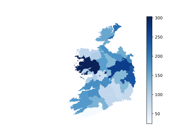
(Source: Hamell; Basemap: CSO Roman Catholic Dioceses 2011)
Finally, we see a network graph of Tuam, Dublin, and Kerry to the years they were represented. This can be used to show what attributes are unique to each diocese.
Fig. 4 Network Graph of geographic distribution
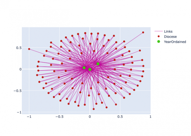
(Source: Hamell)